Evolving Todoist's illustration language
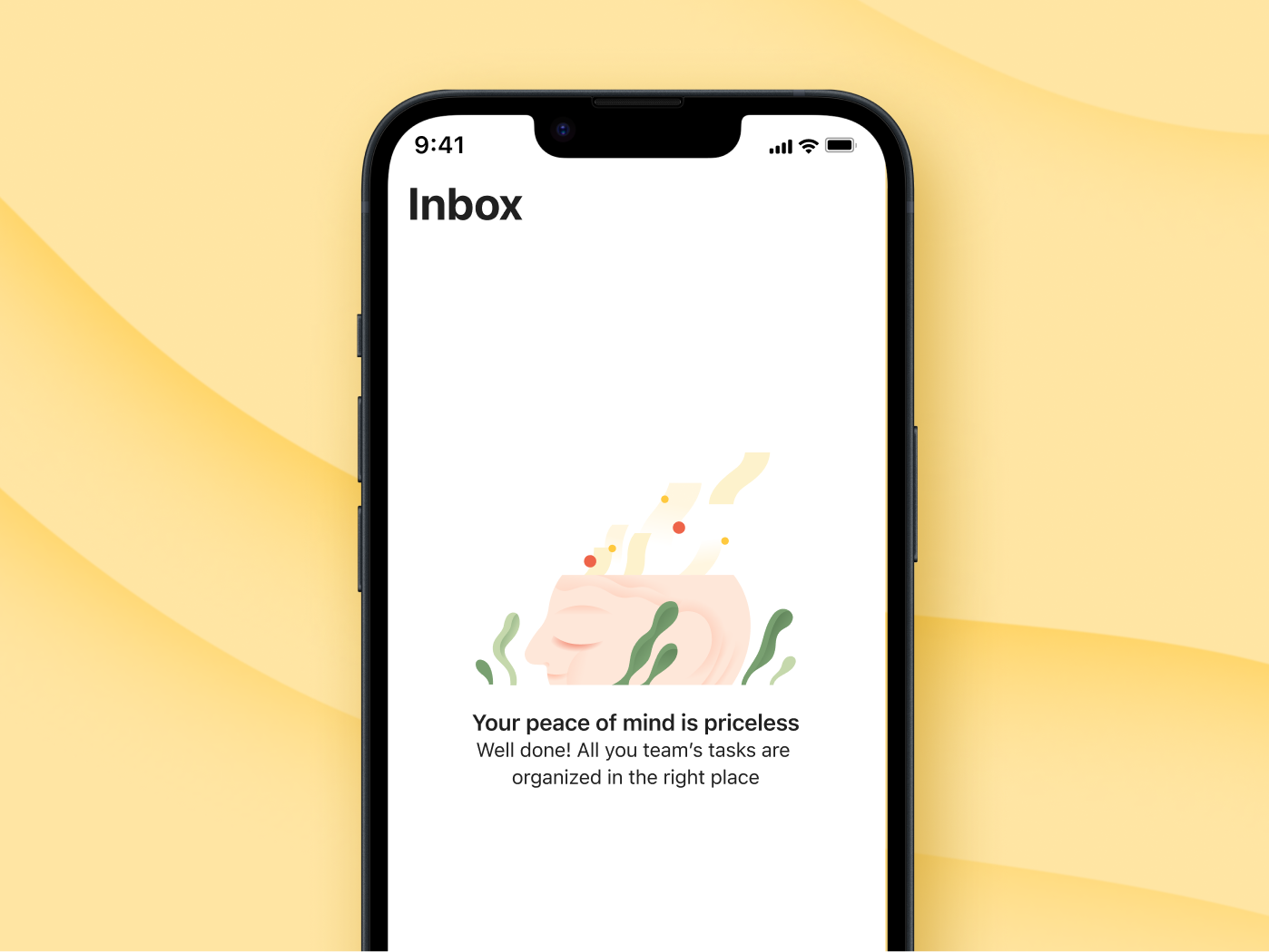
During my years working with Todoist, I contributed to several iterations of the brand's illustration style. This 2024 iteration focused on refining the visual language into a more cohesive and flexible system - one that could work across product, marketing, campaigns and editorial content while retaining the expressive qualities of the illustrations.

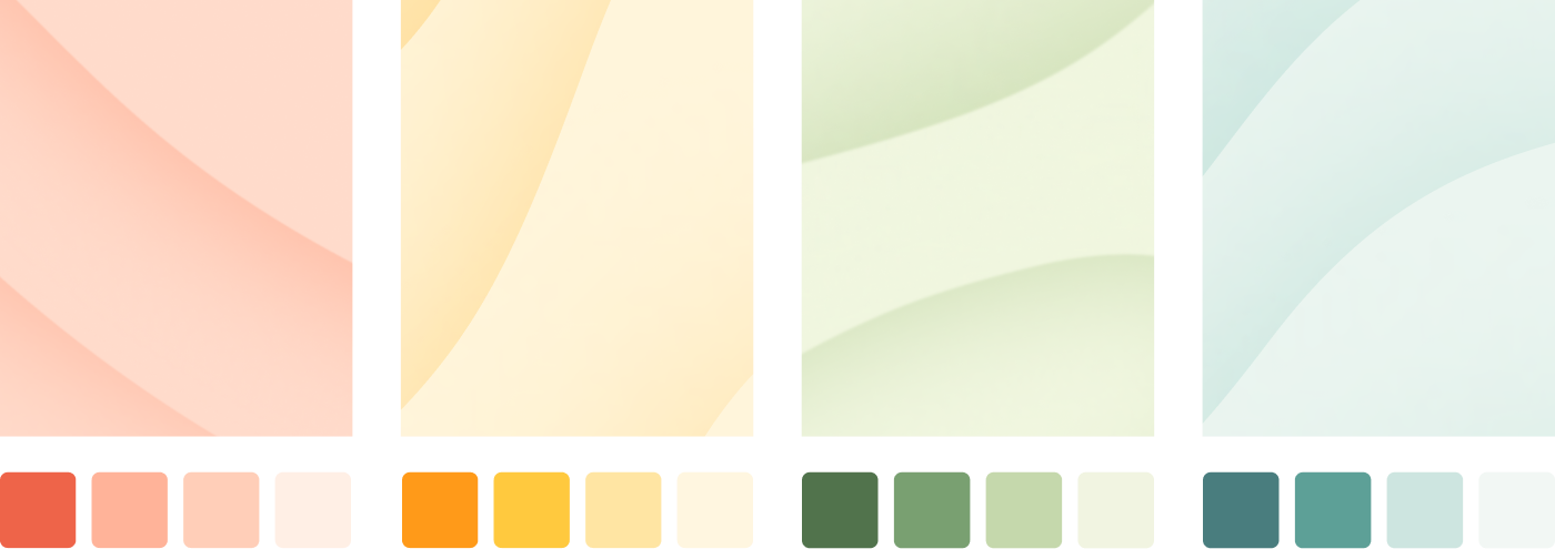
Reviewing the brand palette
Illustrations often live within the product, so the palette needed to complement the UI rather than compete with it. It had to be flexible enough to convey different moods and scenes, while remaining systematic enough to work across technical requirements like light and dark modes and different app themes.
We also established a set of background patterns to extend the palette across brand materials, from social posts to subtle accents when showcasing the UI or in product videos.

Drawing inspiration from Todoist’s Brand Values
Reviewing the illustration style
Human
The illustration language brings warmth and personality to a productivity-focused product, using natural gestures, varied proportions and expressive but simplified forms.

Affirming
Illustrations should always respect the user’s feelings and feel affirming without being prescriptive. Avoid the tendency to depict overly happy and quirky characters, which can feel patronizing or infantilizing.

Trustworthy
Characters are the trustworthy companion throughout the users’ interaction with the brand. They should exude calm confidence, providing users with a sense of assurance and support.
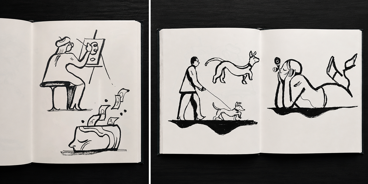
Early sketches & explorations
Early character sketches
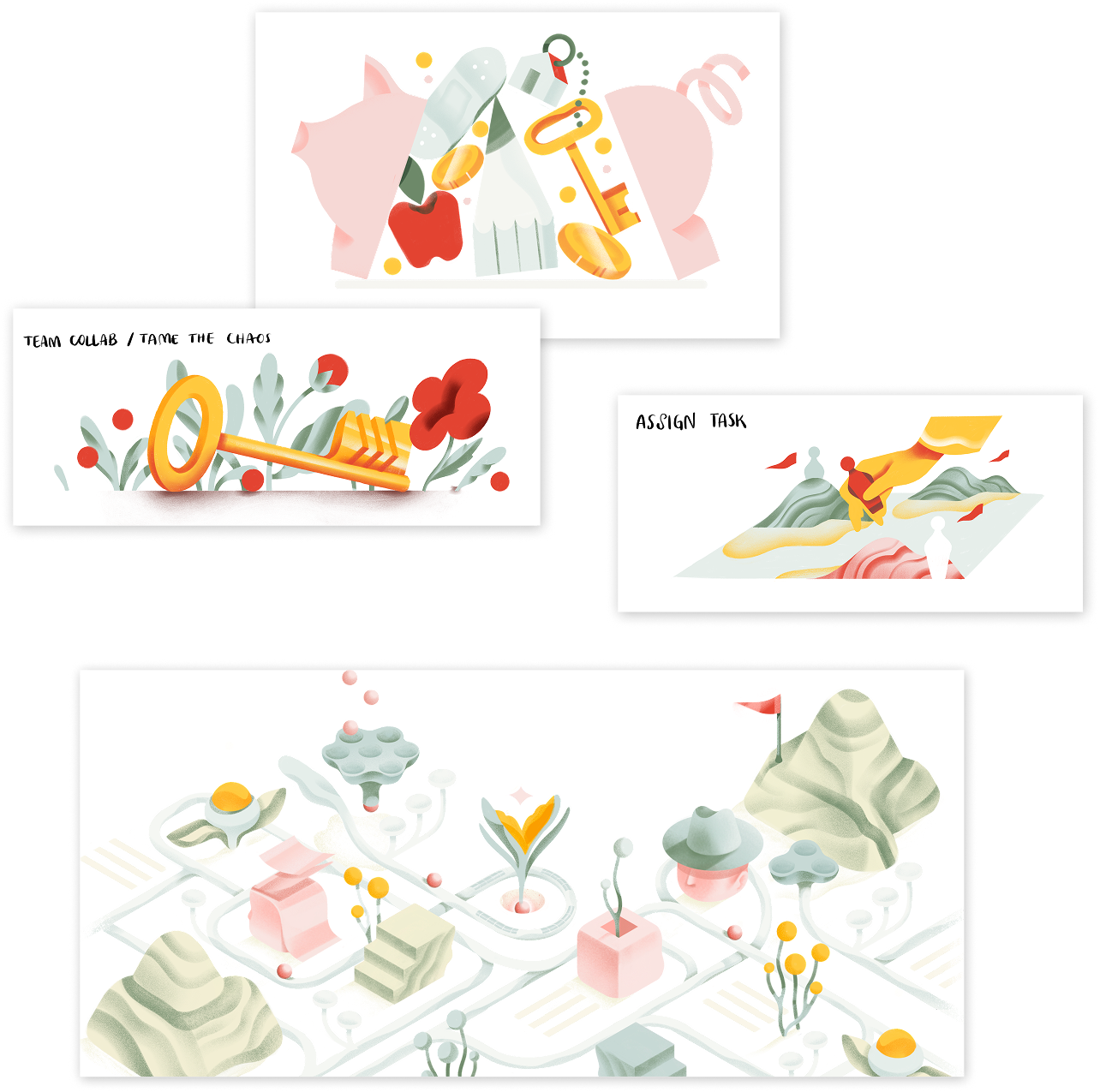
Illustration drafts - exploring colors and palette balance
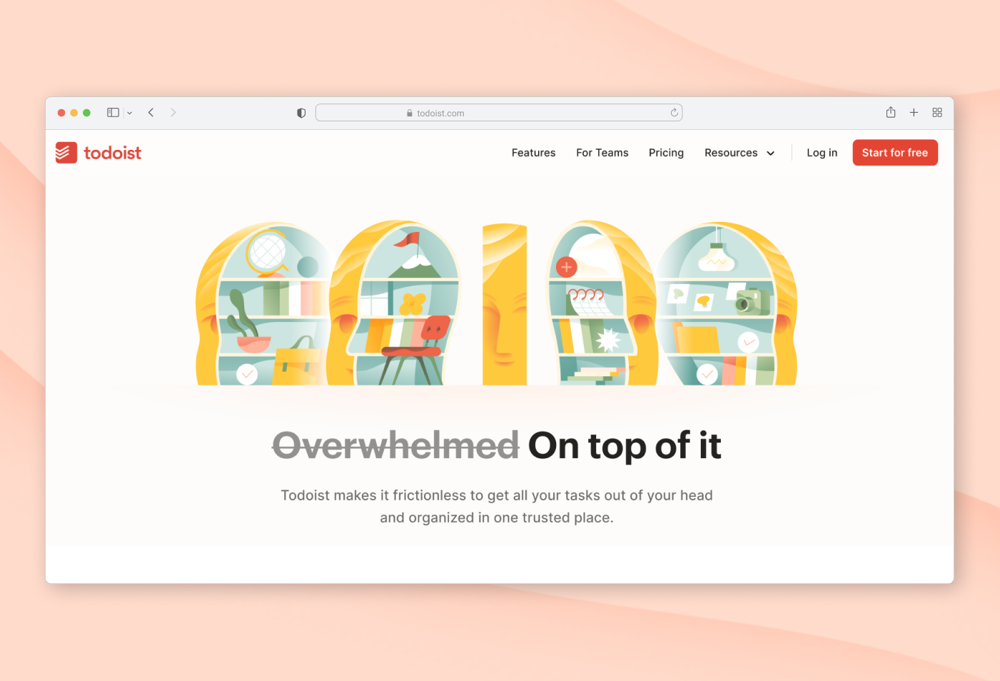
Final Direction